Imagine, you arrived at the trade fair with your product. But everyone is crowding at the competitor’s stand. Apparently, their designs turned out to be more attractive. Thinking about functionality, do not forget to keep in mind the product’s place on the market. When people pay attention to a product, they buy it.
So how do you make an existing product more competitive? Let’s show it using the example of the control panel for the process of applying road markings by STiM LLC.
About the device:
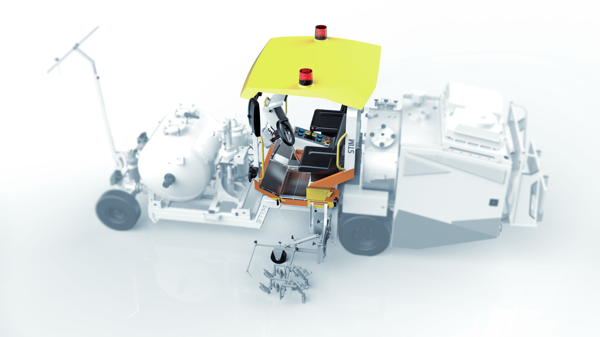
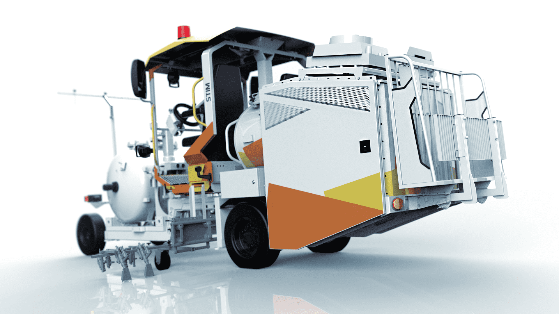
The electronic control and monitoring system of road marking machines based on the M-12 console is designed to control marking guns, technological equipment, as well as control the operation and movement of the road-marking machine. The basis of the system is the M12 remote control, which is capable of working with any type of marking machine. It connects to a set of sensors and an auxiliary mini-remote / joystick for one-touch control of the lane markings without taking your eyes off the road. The control panel automatically generates reports on the performed markup and transmits them via the Internet to the database on the server.
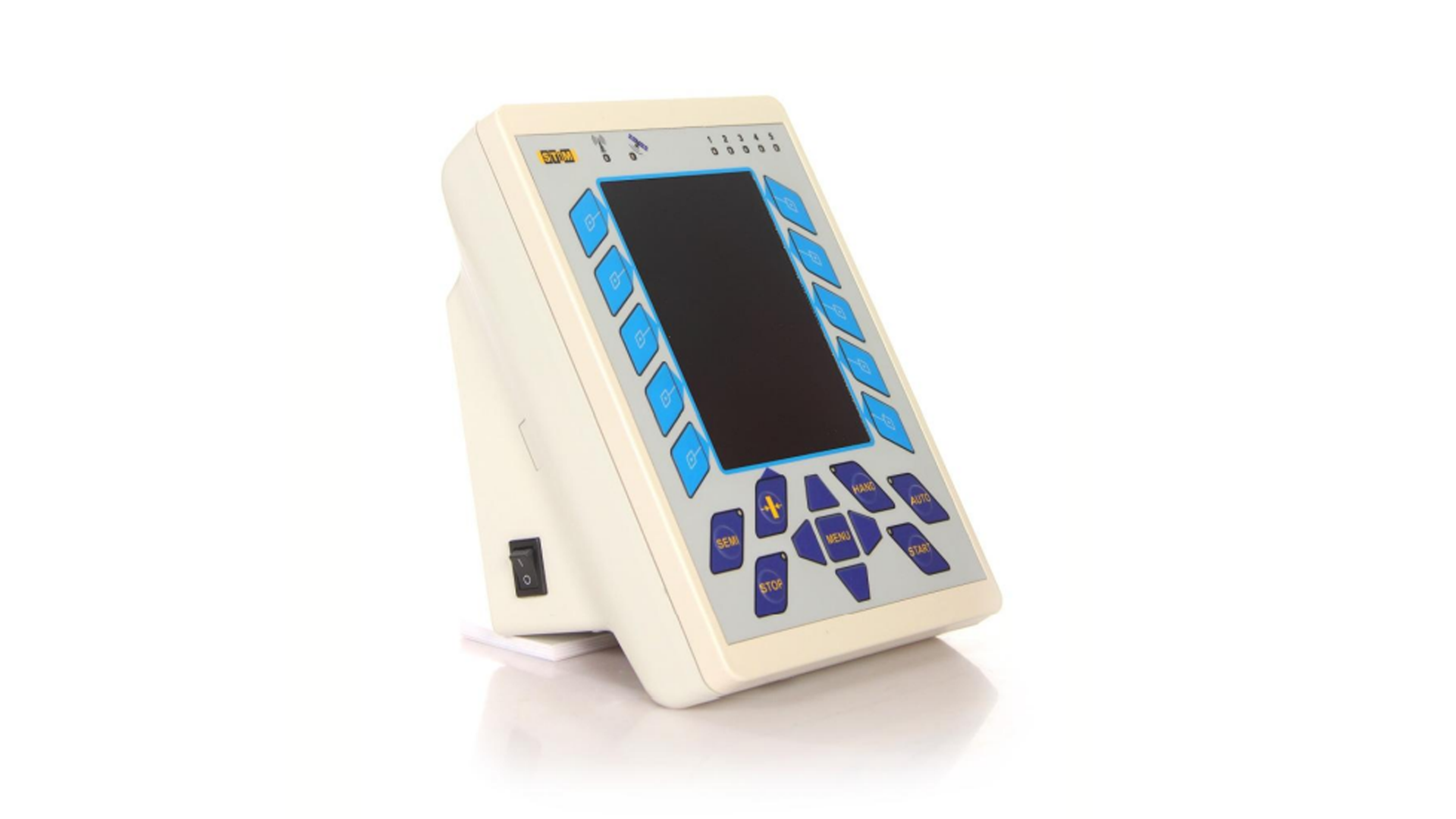
The remote control has a wide range of functions, from a unique algorithm for repeating old markings to a markup simulation mode for training operators. The device is reliable and convenient to use, but over time, even good things outwardly become outdated.
Therefore, together with STiM-Lab LLC, we began work on updating the console.
Task:
Also, in the redesign of the device, you need to consider:
What we did:
First, we studied the direct and indirect analogs of the device. This allowed us to highlight industry trends and made our first suggestions:
Then, a value-role matrix was drawn up in order to:
• form the first technical requirements and constraints for development.
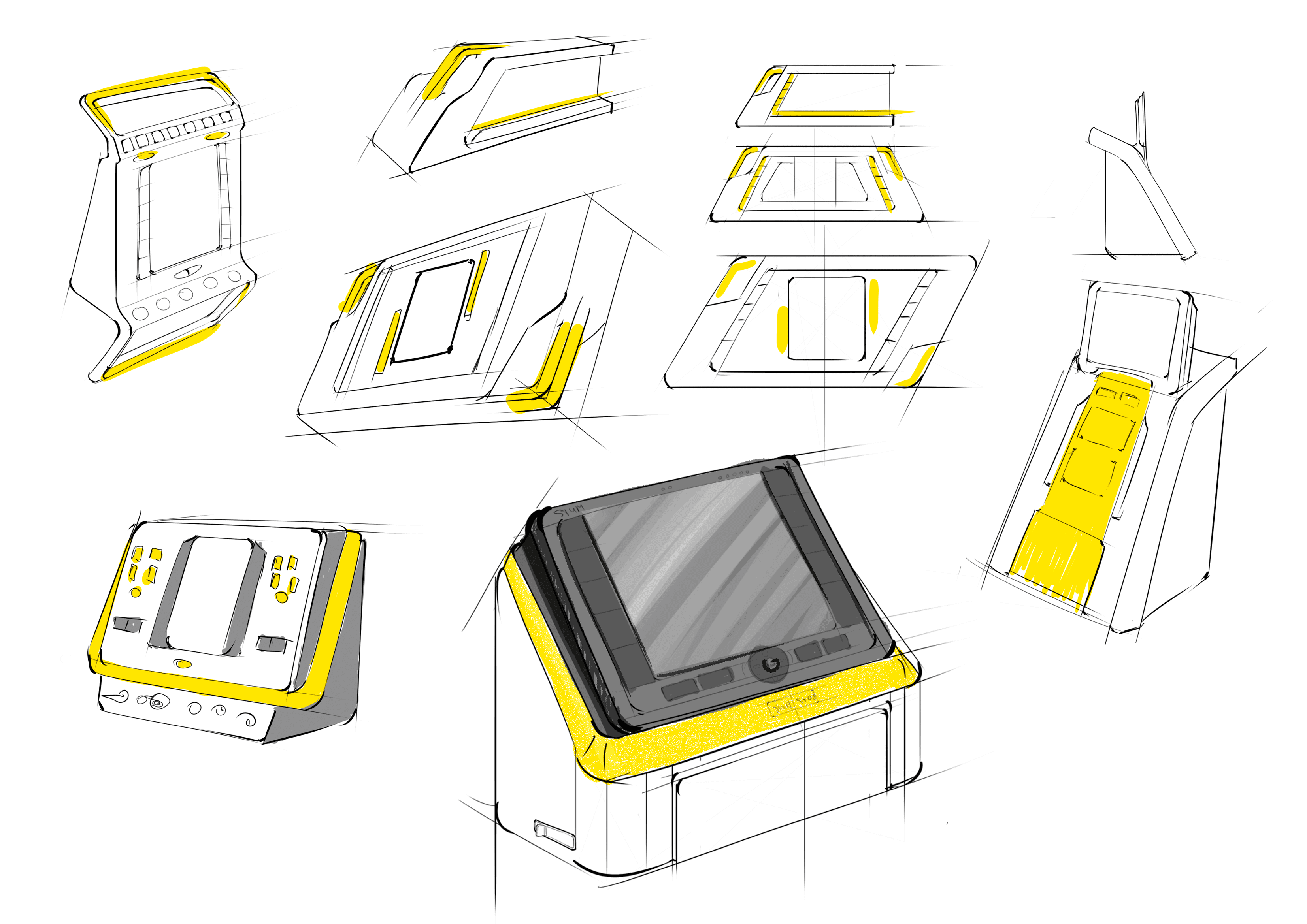
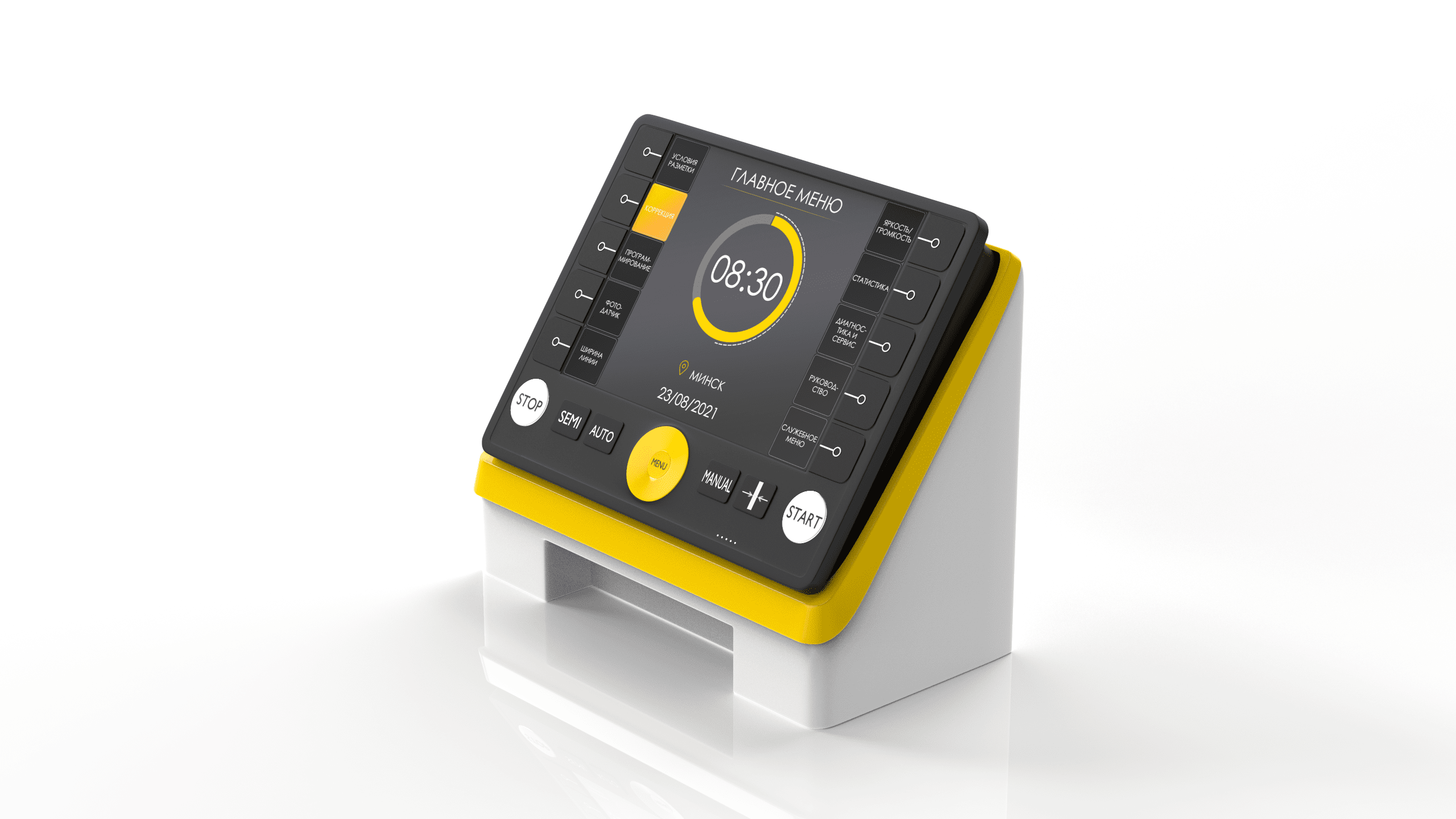
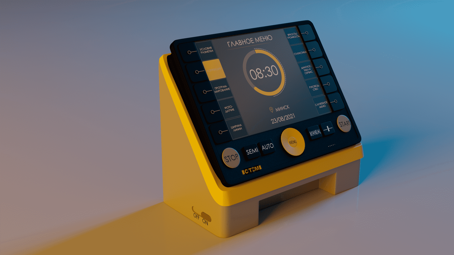
After that, they created a cloud of ideas for the selection of a reference image of the product. It was proposed to compositionally combine the main console and the mini-console.
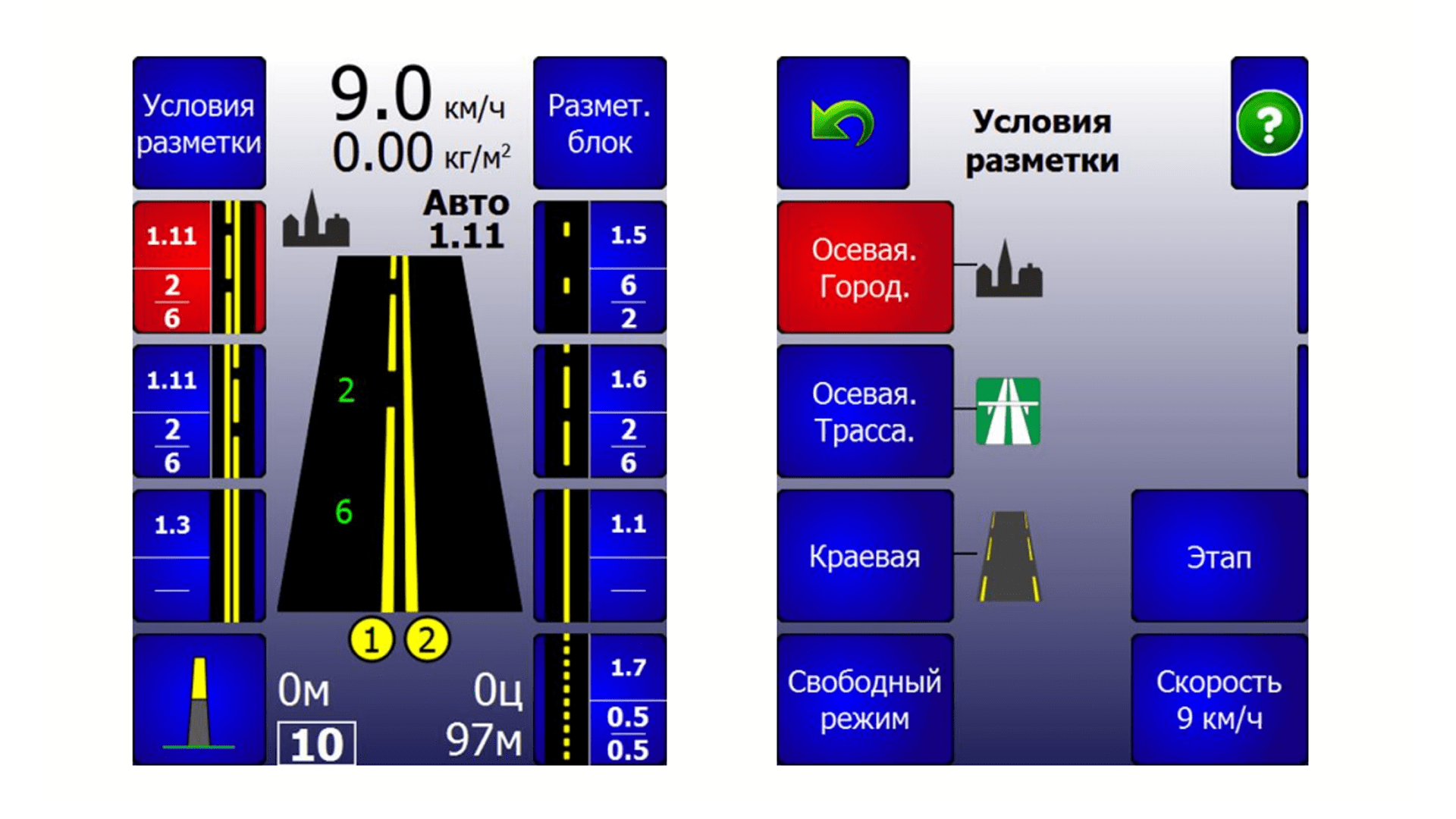
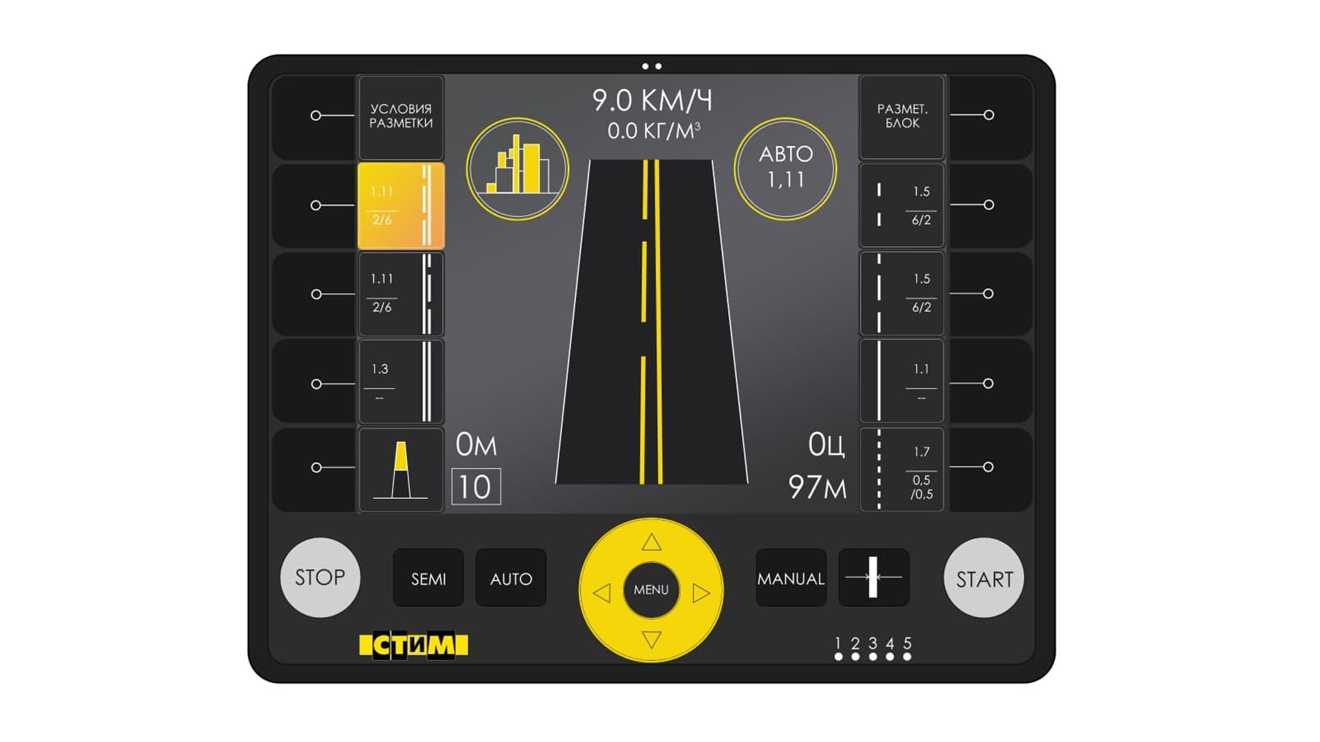
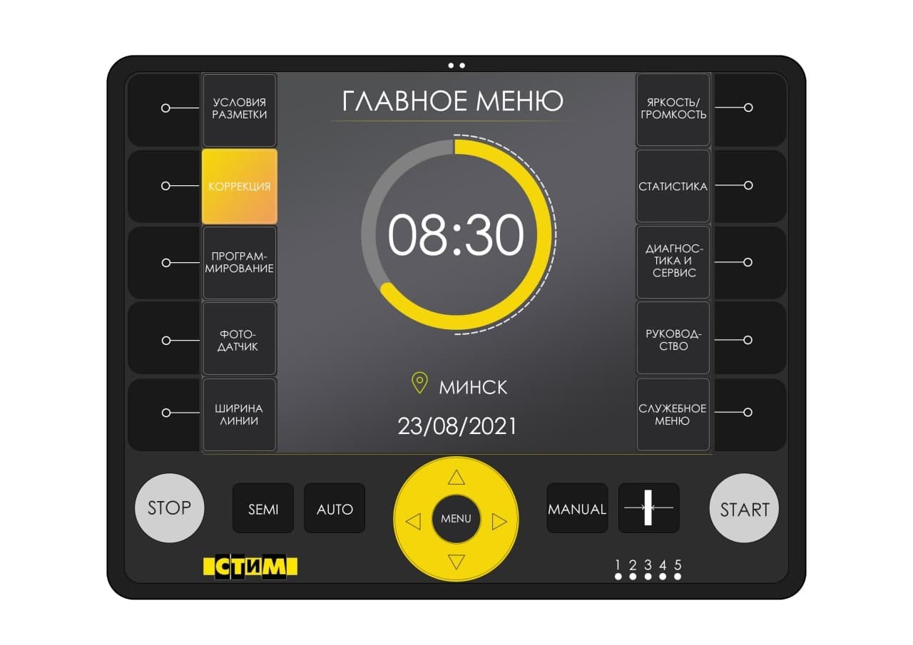
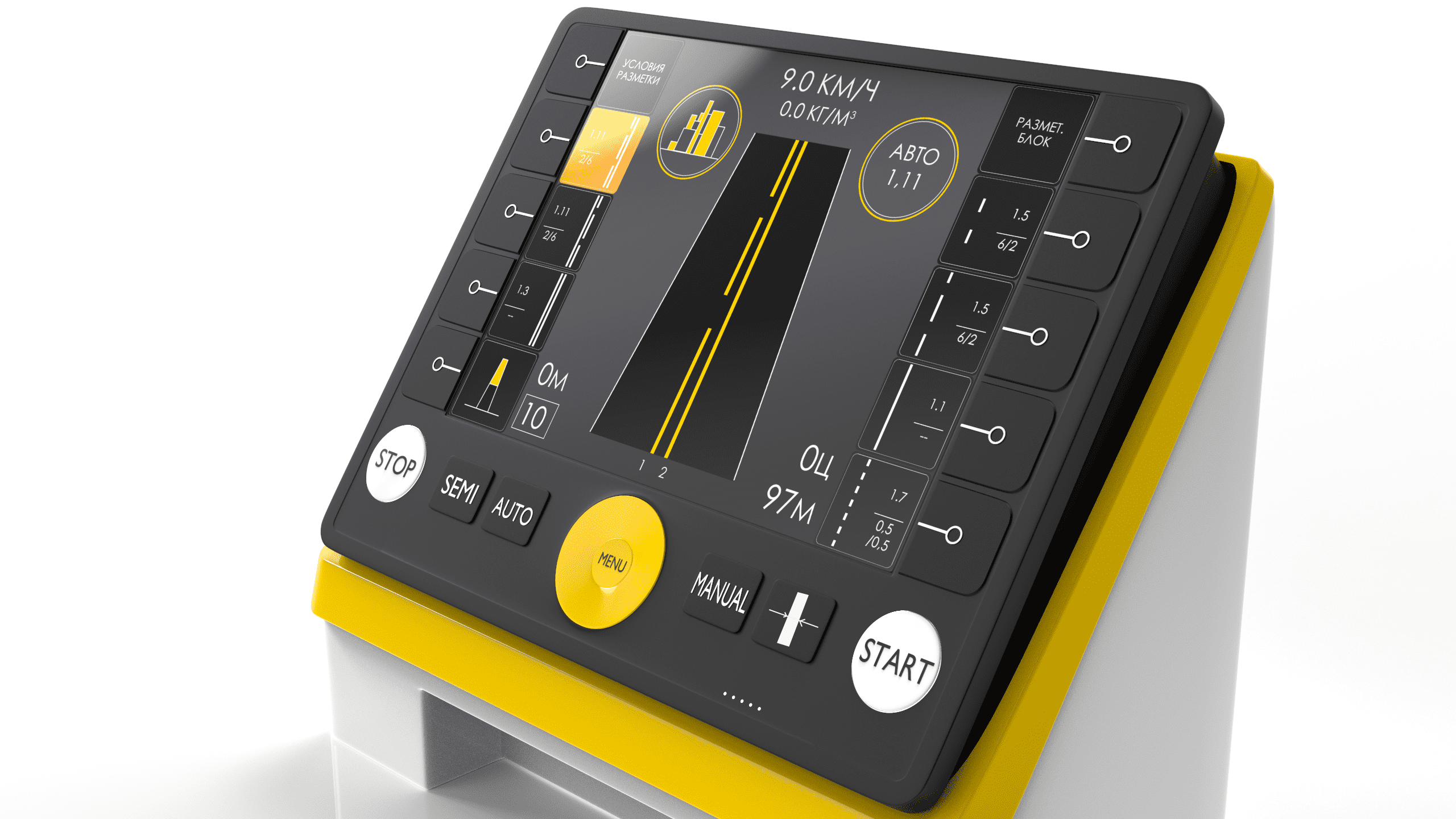
As for the interface, the colors of the Customer’s brand have been chosen, black, yellow, and shades of gray. The information on the screen is designed in a simpler, more understandable, and readable form. Also, we have highlighted the “Start” and “Stop” buttons for easier access to them.
As a result, we got a design project of an aesthetic and functional device that:
The product received new values for the end-user and became more competitive in the market.
Do you want everyone to gather at your booth at trade fairs, and the product sells better? Just get in touch with us!
Designer: Julia Komissarova
Do you want everyone to gather at your booth at trade fairs, and the product sells better? Just get in touch with us! To not miss our new publications, sign up for our newsletter
Also read